
Color is the theme at the WordPress Weekly Photo Challenge. Nice timing because just this week we are starting to see some of the colors of Spring. For the challenge I took some photos of my favorite flower, the daffodil.
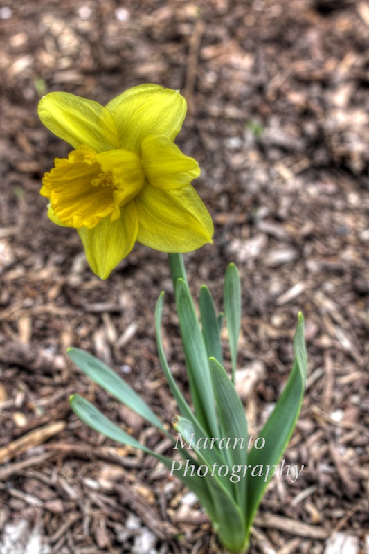
ISO 100 50mm 0ev f/5.6 1/125
This first photo I took using my Canon 50D. I did a bracketed exposure because I knew I wanted to try some HDR post-processing using Photomatix. I used a fast shutter speed in part because it was windy when I was taking these pictures. This particular photo has been processed using the “painterly” setting in Photomatix. Of the different settings I tried, this was the one that showed the most detail in the petals.
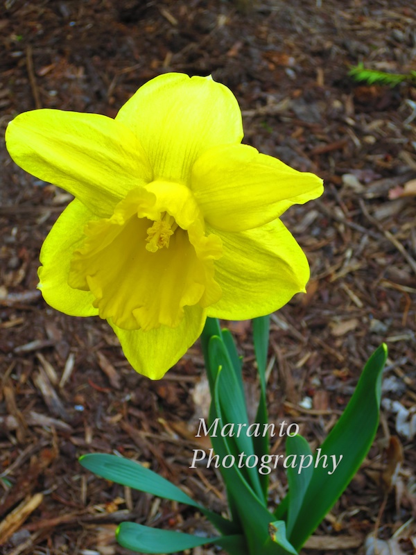
ISO 100 11mm 0ev f/5 1/100
This second photo I took using my Canon Powershot ELPH. I used a setting called “super vivid” to get this effect. While I sometimes like what I get using this setting, this photo I think shows a pretty common “side effect” of using super vivid. Sure there is a lot of color, but you lose some of the detail. It is interesting to me that some of the flower has detail and other parts just don’t. So, as with most camera settings, there isn’t a one “setting for everything” button.
Cheers!

Interesting post. I prefer the first one with more details but there may be some time when you want a blast of color.
LikeLike
I have to say that I agree with you 🙂
LikeLike
I prefer the second. I am willing to give a little on detail to get the added color.
LikeLike
Thank you for saying so 🙂
LikeLike
Beautiful color!
LikeLike
Thanks 🙂
LikeLike
Nice Colour!
LikeLike
Thank you!
LikeLike
Pingback: Weekly Photo Challenge: Color | Flickr Comments
The yellow in the second pic is very vibrant and I think it sings of spring and sunshine
LikeLike
Thank you!
LikeLike
Both are very nice photos. I like that you describe in detail how you shot and processed them.
LikeLike
Thanks 🙂
LikeLike
The Elph camera was my first camera that brought me joy…there has been many more since then…but it will always be my baby☺
LikeLike
🙂
LikeLike
These are great shots in different ways. I also prefer the first one.
LikeLike
Thank you 🙂
LikeLike
Creative entry of this week challenge ‘color’.. Great work.. 🙂
LikeLike
Thanks 🙂
LikeLike
Interesting comparison between the shots. It’s a glorious yellow in the second shot. In the first I think the nature of the background rendered in HDR distracts from the flower – it would look great with a smooth neutral background.
LikeLike
Yes, wood chips in HDR are distracting 🙂
LikeLike
Pingback: Travel Theme: Pale | Photography Journal Blog
I see what you mean about ‘some detail’ in the second shot. I feel like that’s what makes the second my favorite. Both mean spring so YAY! 😉
LikeLike
Thanks! and I am also very excited about Spring arriving.
LikeLike
AAhhhh … the sign of Spring.
LikeLike
I know! I’m so excited!
LikeLike
I usually prefer to keep the detail, but the colour in the second one is so vibrant! I love daffodils, they’re such cheerful flowers.
LikeLike
They are my favorite. Thank you for commenting 🙂
LikeLike
Pingback: Weekly Photo Challenge – Color | Beyond Beauty Tips
Excellent colour absorbtion in the second shot. Elph’s are very well made digicams for the regular consumer. Ther make fantastic shots and they’re quite durable in the field.
There’s a very good reason why Canon is Nikon’s leading competitor in cameras and lenses.
LikeLike
Thanks, I have been happy with this one so far. To me the one thing I am not crazy about is the touchscreen on the back, I actually find that to be an awkward way to change settings. I know that is just the way it is going though, so I’ll just have to get comfortable with it.
LikeLike
I love yellow! So bright and pretty, and I like the details of the petals in the first one. Nice!
LikeLike
Thanks so much 🙂
LikeLike
Gorgeous. Yellow is such a cheerful color!
LikeLike
I agree, yellow is 🙂
LikeLike