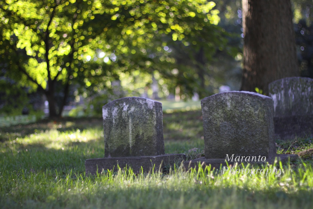
This week I am working on creating a panorama for my Photoshop class. It is a series of gravestones that includes this image:
In the panorama there will be a panning to the left to reveal other gravestones. But as I was looking at the image and thinking about this week’s photo challenge theme saturated, I was thinking about not only the amount of color but the actual color and the texture.
I also, just a few days ago, downloaded some free software from DXO and Sony. It is DXO FilmPack 3 which is free to download until October 31, 2013. I had installed it and have it running as a plug-in in both Aperture and Photoshop. The software allows you to give your digital image the feel of film. So, here is that same photo with a Kodak Elite Chrome 400 filter:
Completely different isn’t it? What do you think? I like it, but I think for my panorama project I will stick with the green version. I’m also thinking that I am going to be able to find a lot of uses for this software. I will also say, that I think it is fairly easy to use. I didn’t really dig into it, but I got it up and running really quickly which is something that I always appreciate.
I’ll also tell you that I found this software thanks to another blogger, Lignum Draco. I have included a link to a recent post of his that I enjoyed. He does mostly street photography, which is something I almost never do. I enjoy looking at the work of photographers whose images are a lot different than mine. You never know where you will find inspiration or free software, so I’d like to thank him for blogging and sharing his work.
Thoughts about my images? Do you also look to the work of others for inspiration? Feel free to leave a comment below.
Cheers!


It looks like you got down low for the shot and I think that makes it very effective. I look forward to seeing the panorama. That software does look like fun so thanks for passing along the info. And, yes, one of the things I like about taking photo classes is seeing the work of others.
LikeLike
I had my tripod do the getting down low for me. I have one of those that can be almost flat on the ground, and that is pretty much where it was for this photo. The panorama is a work in progress, but I’ll keep you posted 🙂
LikeLike
Interesting to compare the digital to the “film” versions. The “gold” tone in the film version washes out some of the detail–I think. I agree–stick to the “green” version for your project.
LikeLike
Yes, it is interesting to see what it adds and what it takes away. There is less detail and I think that is part of the reason I am going to stick with the “green” version.
LikeLike
The transformation to the second image is impressive – I am now off to download DXO 🙂 Thanks for sharing.
LikeLike
I’m sure you can come up with some creative results!
LikeLike
Thanks for the link and info! I like the green version too 🙂
LikeLike
It was interesting as I was clicking through the various options, the grain that was added in, which can be a nice effect on a subject matter like gravestones.
LikeLike
Beautifully done–so evocative!
LikeLike
Thanks! It did create a beautiful feel, but not what I was going for with this project. Something I will come back to though.
LikeLike
I love it.
LikeLike
Thanks!
LikeLike
Thanks for the feedback. I’m glad you’re enjoying this software. It does completely change the character of the original image. And many thanks for the mention too. Cheers.
LikeLike
Thank you 🙂
LikeLike
Interesting! I remember using Kodachrome, which always gave ‘warm’ images, as opposed to, say, Fujifilm which had more of a blue cast, so your greens really would be green! I’m just off for a wander over to Lignum Draco…
LikeLike
That is one of the cool things about this software, you can see a bunch of the filters all at once. It does you a good idea of how different the different types of film are. I hope you enjoy Lignum Draco’s work. See you again soon, Cheers!
LikeLike
Yes, see you soon! 🙂
LikeLike
🙂
LikeLike
I like the graininess and the gold color…perfect for fall!
LikeLike
I suspect that particular filter appealed to me over the others because I was thinking of fall 🙂
LikeLike
I just the effect you got on the second photo PJB. Stunning and I love it. It’s a great shot as well and thanks for the link to the plugin. I like trying new software and this looks quite interesting. Much appreciated. 😀 *hugs*
LikeLike
I laughed a bit to myself when I read your comment 🙂 I’m sure you’ll do wonderful things with this software as you get great results with your photo editing. I look forward to seeing what you create 🙂
LikeLike
This is just perfect for the fall season…love all the glimmer.
LikeLike
Yes, and I saw that you were thinking fall also: http://wp.me/p280V5-4a6 I just love the rich tones of fall.
LikeLike
You are very inspiring, in that I want to go play with the editing on my photos after I read your posts. I’ve also been playing with the settings on my camera (I use a point and shoot Nikon Coolpix) and it takes some getting used to when to use which settings. I don’t always make the best choices. So far I’ve learned when it matters, I should just choose the auto-mode and let the camera decide. Maybe if I play around enough, I will make better choices when it counts.
LikeLike
I think that auto mode is a great place to start. If it is a situation where you have some time after that first auto shot, you can take a look at the result on the back of the screen and think about what you would like to have in the image and adjust your settings and see what you come up with. Auto mode often gives you a solid base and for those times when you just have one shot and aren’t certain. It can be the difference between having a photo and not having a photo. Editing photos later can be fun and time consuming 🙂 Thanks for commenting.
LikeLike
I like both actually PJB . The second set of gravestones look like they have an almost ‘mirrored’ suface . Interesting .
Seems like you are enjoying your workshops 🙂
LikeLike
Yes, it was interesting the texture that the film filters provided. For this photo, I think the added texture is a nice touch. I am enjoying my class, and I am learning a lot 🙂
LikeLike
Pingback: Weekly Photo Challenge – Saturation | Joe's Musings
There is a more haunting quality to the top photo. Perhaps it’s the purplish headstones. Excellent.
LikeLike
Thanks!
LikeLike
The different colour gives it the feel of sunset or autumn.
LikeLike
It does give it quite a different feel.
LikeLike
Both photos look great! Thanks also for sharing the link 🙂
LikeLike
Thanks!
LikeLike
I like the warmth in the second image, but the green goes more with the mood of a cemetery.
LikeLike
Thanks. This is still a project in progress, but I did decide to stick with the “green” version. 🙂
LikeLike
Pingback: Weekly Photo Challenge: The Hue is Green | Photography Journal Blog