
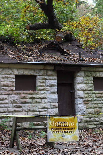
You never know what you might come across when you are out hiking. In this case, I was deep in the woods. The travel theme this week at Where’s My Backpack? is deep, so I figured I was in the right place. Turns out, I was in the right spot for a little mystery:

ISO 640 50mm 0ev f/5.6 1/160
I’m not sure which question I had first; was it, why is there a stone building here? or which storm?, we get a lot of them and I was just curious to know which storm the sign was referring too. I was at the Babler State Park in Missouri on a Monday so the visitor’s center was closed, so my questions will have to wait for another visit. And I will be going back, it is a nice park with hiking, biking, and equestrian trails.
Here is my original photo:
ISO 640 50mm 0ev f/5.6 1/160
I don’t know about you, but when I first looked at it, I thought the color was just wrong to go with the theme of deep. I wanted the richer orange color you see in the finished version. To get the look I was going for, I opened the photo in camera raw, and in the basic settings I adjusted the temperature setting to be a bit warmer. Then in Photoshop, I opened up a film plug-in and applied a Fuji Provia 100F filter. I thought that the little bit of texture that the filter added helped with the deep theme. I also sharpened it a bit.
What do you think? Does the first one say “deep” to you more than the second? Feel free to leave a comment below.
Cheers!

Good post-you’ll have to let us know when you find out! Do t know about more “deep” but certainly more fall-like.
LikeLike
It’s always good to have an excuse to revisit a park 🙂
LikeLike
Just such a cool old building…this government shut down…there are just no words!
LikeLike
There are a lot of CCC-era buildings in the area, and I suspect this one is from that some time.
LikeLike
I very much like the reworked photo. You give me hope that I can turn some of my typically mundane photos a bit more glorious. I need to move back to shooting in RAW+Jpeg and then doing the good work of excising old/bad shots. So far I’ve not had the courage to delete photos. I noticed your rather high ISO: were you shooting in lower light? Great post and I’m going to lift your last paragraph and try it on my own photos!
LikeLike
It took me awhile to get to the point where I was willing to delete photos, but at some point I began to feel overwhelmed by the number of images I had. At that point I gathered my courage, put my ego in check, and deleted a bunch. The light was what you might call “crummy”, I believe that is the technical term for it. It was overcast, so bright; but we were in a pretty wooded area, so dark. I also increased the ISO because I wanted a higher shutter speed because I was doing some bracketing and did not have my tripod. The film filter I am talking about in Photoshop was actually a plug-in. It is available until the end of the month for free. If you are interested, here is the link: http://www.dxo.com/intl/sony
LikeLike
The brown color of the house does look more “deep”. Nice photo!
LikeLike
Thanks!
LikeLike
Nice work editing this photo! They both say “deep” in the woods to me and I really like your color choices in the final result.
LikeLike
Thank you 🙂
LikeLike
yes, I think you are right, the warmer colours of the first one are pleasing, but the fallen tree on the roof says ‘deep’ quite well enough for me!
LikeLike
Thanks!
LikeLike
I like the first one best. It has a more woodsy feel, and the orange coloring does give the home a richer feel. Excellent photo.
LikeLike
I think part of it for me is that green tends to make me think of spring. When I think of spring, I think of light and not deep.
LikeLike
Looking at the 2nd photo thru another lens (yours), I see what you mean. It does look more like spring.
LikeLike
I’m glad you applied the filter to the photo because I like the result more than the original one 😉
LikeLike
Thanks!
LikeLike
What exactly does the sign say? Your watermark is covering most of it! Thanks.
LikeLike
It’s very water logged but it says: “Warning area closed hazardous conditions from storm damage” Kind of ironic that it would be necessary to close a building with a partially collapsed roof, you think it would be pretty obvious.
LikeLike
Aah! Got it. Thanks.
LikeLike
Thank you 🙂
LikeLike
Great images!
LikeLike
Thanks!
LikeLike
I had to keep going back and forth between the two because I like them both! But I finally decided that I, too, like the one with orange-y tint best!
LikeLike
Thank you! opinion is a bit divided on that issue and my theory on that is that the difference in tone really makes these two different photos, despite being the same.
LikeLike
I am an amateur photographer and I must say I prefer the original.
LikeLike
Thank you for saying so 🙂
LikeLike
I like the adapted version. I used to play in Photoshop quite a bit, and had no shame in coaxing evocative pictures out of otherwise everyday ones. They are two very different images despite being the same source!
LikeLike
It is interesting isn’t it? how it can be the same photo, yet completely different. Thanks for your visit 🙂
LikeLike
I like the one you’ve changed, it’s warmer.
LikeLike
I like it for that same reason 🙂
LikeLike