
Feathers is the theme offered by Sonel’s Photo-Editing Challenge. This week I am working on a series of images inspired by Photogravure. I’ve written about how to create this effect here, using a winter scene and a journal page, and here using a photo of a tree.
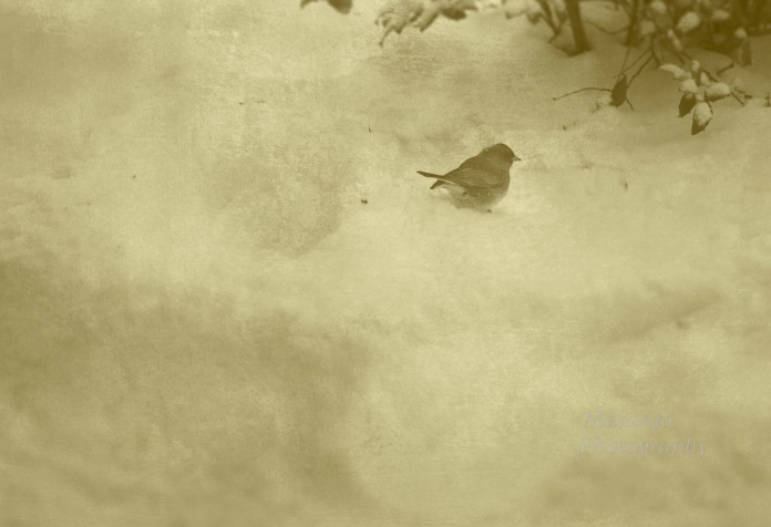
This time around I used a shot I captured outside my office after a recent snow. Here is the original photo:

ISO 640 50mm 0ev f/9 1/250
If you are thinking that you have seen this photo before on this blog, you are right. I wrote about another edited version of it here. This time around, here is my final photo:
ISO 640 50mm 0ev f/9 1/250
If you have read my other posts you know the basics of how I approached the editing of this photo. So, like the others it has a blur filter layer, a gradient map layer, and a texture layer. What I added to this particular one was a final levels layer. On that layer I brightened the photo and then added a mask to the layer. Then I inverted the mask, so that the lighten version was not showing. Then I took a brush, that was soft and had a jitter to it, and I brushed across the mask. The effect this had was to add bits of light in a organic manner. So, this ended up being a four layer file in Photoshop.
What do you think of the final version? Feel free to leave a comment below. A version of this photo is available for sale on Picfair.
Cheers!

Nicely done. An interesting technique.
LikeLike
Thanks, and this has been an interesting assignment, so many possibilities, I really like that.
LikeLike
Cute capture! 🙂 thank you for visiting my blog this morning 🙂
LikeLike
Thanks and you are welcome, I appreciate your return visit 🙂
LikeLike
You’re so very welcome 😀
LikeLike
Reblogged this on Sonel's Corner Photo-Editing Challenge.
LikeLike
Beautiful shot and I like the texture in the edit Amy. Thanks for taking part and for sharing. 😀
LikeLike
Thanks and thanks for re-blogging, I do appreciate it 🙂
LikeLike
I like it. I think It has a dramatic canvas painting look.
LikeLike
Thanks, I agree, I think this technique does tend to look that way.
LikeLike
The second photo looks like a haiku! Love it!
LikeLike
I know you write haiku, so what any awesome comment you have left me 🙂 Let me know if you write one based on this photo. I used to write poetry, and I always thought haiku was a difficult style to write in, yet so beautiful when done well. Thanks for your comment 🙂
LikeLike
I love the original photo. I think the snow looks really cool in the edited version. It reminds me more of clouds than snow. Overall, the edited picture reminds me of old photos. Pretty.
LikeLike
Yes, particularly in the lower left corner, I am reminded of snow. That is the effect that adding the texture layer brought to this photo.
LikeLike
i love your edit. It has much more depth. 🙂
LikeLike
Thanks!
LikeLike
You have beautifully captured the essence of the delicate feathered friend surrounded by a fluffy snow scene.
LikeLike
Thank you 🙂
LikeLike
I like how it came out! 🙂
LikeLike
Thanks 🙂
LikeLike
I like how it came out, but found the yellow a bit too much – especially the square shape section in the edited version – it is just snow – but I found that it was bottom heavy – I dunno – but thanks for sharing about the layers – and you definitely captured a vintage look. 🙂
LikeLike
Thanks, the yellow was a bit much when printed on the white paper, but worked better on the tan paper. The cropping you are talking about, I keep going back and forth about, I agree, it is a bit bottom heavy. The print that worked best on the white paper was actually this shot with the blending mode set to multiply, that darkened the whole thing and deepened the shade of yellow which was a better look. Thank you for your honest opinion.
LikeLike
your welcome. 🙂 and it is really fun to see and hear how and what you do with this – truly takes art and skill….
LikeLike
🙂 and time…
LikeLike
When I recall snow, it is always crisp and white. Even if it wasn’t. 😉 That’s why I prefer the first photo, Amy.
LikeLike
Thanks for leaving an honest opinion, I appreciate it. This snow actually still looked pretty good 🙂
LikeLike
I like them both, the second reminds me of a painting or definitely an old photo. Both beautiful.the first I can feel the cold of the snow.
LikeLike
Thank you 🙂
LikeLike
the first photo shows the softness of the snow. that one is my preference.
LikeLike
Thanks for saying so 🙂
LikeLike
Pingback: This Project is Complete, On to the Next One | Photography Journal Blog
A very beautiful aesthetic. It even reminds me more of a calotype than photogravure.
LikeLike
Thanks, I do think I was pushing this assignment a bit.
LikeLike