
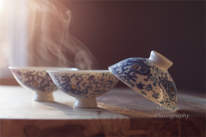
The WordPress weekly photo challenge asks for a story told in three pictures. I have three pictures for you. It is another evolution of my food photography project which is now on it’s third post. Here are the photos:

ISO 400 50mm 0ev f/4 1/100

ISO 400 50mm 0ev f/4 1/100
ISO 400 50mm 0ev f/4 1/100
These photos were taken as the sun was going down, hence the golden light. I shot a series of them also in the morning light and they have a much colder feel to them. The second photo was shot with a piece of black paper in the background to make the steam visible. The third photo is actually a combination of the first two photos that I created in Photoshop.
First, I started with the two photos in Bridge and went to Photoshop-load as layers. That opened the two photos in a single layered file in Photoshop. From there I went to Edit-Auto Align Layers and used the auto function to line up the two photos exactly. Because I used a tripod and shot them in a sequence, the two photos had already been pretty close, but not exact. Then with the darker photo on top, I dropped its opacity. That is how the third photo came to be.
What do you think? Is the hybrid photo your favorite or do you prefer one of the other ones? I have also changed the composition of the photos again. Do you like it better or do you prefer something you saw in post one or post two? Feel free to leave a comment below.
Thanks to everyone who has been commenting on this project as I have been working on it. Once one of my photos is accepted in class, I will probably be making some other adjustments in Photoshop, just to clean it up.
Cheers!

I prefer the second photo. Don’t ask why on a techie note because you’ve lost me with all that PS stuff! The reason I like it is because of the swirls in the steam are clearer 🙂 and because it’s a nicely composed shot – as are the other two…
LikeLike
Sorry if my Photoshop notes put you to sleep 🙂 and thanks for taking the time to say why you preferred that particular one.
LikeLike
Oh they don’t bore me I just don’t understand it all – wish I did! 🙂
LikeLike
Oh, OK 🙂 I like to write out stuff like that so that I can refer back to it as I am working. I do find writing it out can help me understand the process better. Sometimes, it does seem complicated when you read it though, part of the reason I struggle with reading books about Photoshop 🙂
LikeLike
I try You Tube which is quite good but a pain jumping from screen to screen. I’ll get there eventually!
LikeLike
Yes, I have found some good stuff there. If you are actually using Photoshop checkout AdobeTV as well.
LikeLike
Thank you I will 🙂
LikeLike
My favourite is the middle one, but to be honest I can’t see a difference between the second and third. I definitely prefer the composition with the steam, so this is my favourite of the three posts. Lovely shots!
LikeLike
Yes, it is a subtle difference, and I am not sure if I’ll be messing with the Photoshop version more, or perhaps just trying something else. I do like the steam that was added in this round, so I think that will be staying in this project. Thanks for commenting 🙂
LikeLike
I think all the images in all three posts are beautiful! I can’t choose just one: The red tablecloth really adds punch … the steam and background in your second photo above grab me … so I have to say it’s a tie. 🙂
But they really are all striking!
LikeLike
Thank you for leaving your thoughts, I do appreciate it. I am leaning toward leaving the red tablecloth out for this project but haven’t completely decided.
LikeLike
I do like the third one.
LikeLike
Thanks 🙂
LikeLike
Lovely photo, I like the low angle and the light……but I don’t really see much difference between the second and third shot….so I will choose the second shot as it didn’t take so much work!
I am viewing this on an iPad which might mean the image quality isn’t good enough to see the subtle differences though 🙂
LikeLike
It is a pretty subtle difference. I haven’t decided quite yet what I think of it, and may still decide to edit it yet another way 🙂
LikeLike
Love the light!
LikeLike
I was pleased with that element in these photos 🙂
LikeLike
Beautiful!
LikeLike
Thanks 🙂
LikeLike
This is a series of amazing images, Amy! It’s incredible you captured the steam, and the morning sunlight adds a beautiful atmosphere. Thank you for sharing the process of making this perfect photo!
LikeLike
Actually, these are my afternoon ones, the morning photos have a much colder feel to them. I haven’t posted them yet, but might just because they are so different. It is amazing how much difference the light can make in the outcome of a photo.
LikeLike
I’m not sure which is my favourite, but I love the way you got the steam showing so clearly in that second shot!
LikeLike
Thanks for saying so 🙂
LikeLike
Pingback: Nightly Colors | THE MARRIED MAN WHO LOVES HIS X
I love the simplicity of the first shot. Great composition.
LikeLike
Thanks, I really was trying to make something simple with this image.
LikeLike
So pretty, Amy. Love the way the steam looks in the last two. Excellent shots. 🙂
LikeLike
Thanks 🙂
LikeLike
Pingback: Weekly Photo Challenge – Threes – Third Round | Through the Eye of Bastet
Pingback: Weekly Photo Challenge : Threes | Pekalongan International Batik Carnival | ISENGRAPHER™
I love these tea images you are creating. The middle one is my favourite here. : )))
LikeLike
Thanks for saying so 🙂
LikeLike
Pingback: Weekly Photo Challenge – Threes | Joe's Musings
Its not about which one I like better….but your styling of the photos are wonderful!
LikeLike
Thanks so much!
LikeLike
I prefer the darker background of the 2nd image. I do like how there is a bit more light on the cup in the third image. Instead of layering the first two images, maybe you could bring up the shadows and highlights of the second image on the cup in the foreground.
LikeLike
Thanks for your comments, I am working on a bit of a combination of the 2nd and 3rd right now, specifically trying to leave the background a bit dark and have light on the foreground cup.
LikeLike
I love the second shot. And thank you so much for for all your tutoring. I have made a note of looking up Adobe TV!
Big hug, Dina
LikeLike
Thanks, and I hope you find it helpful.
LikeLike
Oh, you make it so difficult for me to choose Amy! I love all three! Fantastic job and shots for sure! 😀
LikeLike
It has been a bit of a challenge to decide what I like best and work from there 🙂
LikeLike
Pingback: Six Hundred Abandoned Photos | Photography Journal Blog
The second photo looks great. 🙂
LikeLike
Thanks 🙂
LikeLike
thanks for the tutorial also.
LikeLike
You are welcome, I hope you found it helpful.
LikeLike
Love the light and the steam.
LikeLike
Thanks, that is one element I ended up really liking 🙂
LikeLike