
One of the things that is tough about taking a Photoshop class is concern about my grade. I can’t help it, and I probably worry about it too much. What should be most important is if I think I am learning something, not what letter has been assigned to my most recent project. This post is about my most recently turned in, but not yet graded project, and is also my response to the Weekly Photo Challenge, Letters.
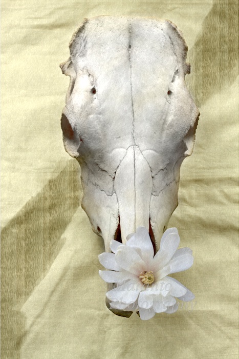
If you have been by the blog in the last few weeks you know that I am working on a project that is a tribute to Georgia O’Keeffe’s Cow’s Skull with Calico Roses. Since I wrote about it last this project went in for a final critique and then was turned in as a finished project. One of the major changes I made before the final critique was to change the overall color of the image. Here is what I had:

ISO 100 50mm 0ev f/5.6 1/125
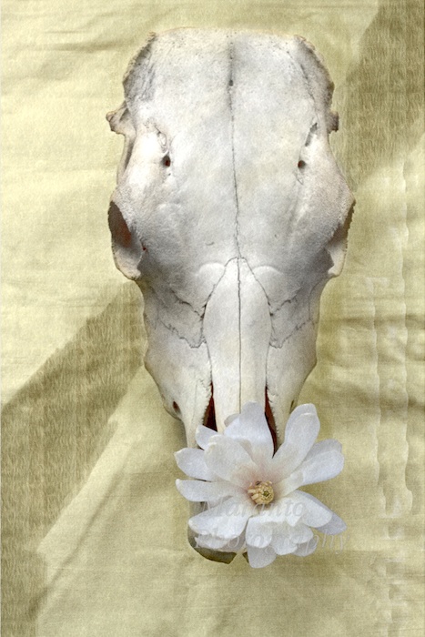
And here is the next version:
ISO 100 50mm 0ev f/5.6 1/125
I changed the color in Photoshop using Image-Adjustments-Match Color and matching it to the original painting. You may also notice that I removed the oil paint filter from the cow’s skull and instead put a slight blur on it. I applied a similar amount of blur to the tree blossom.
Based on the feedback I got in my final critique here is my final version:
ISO 100 50mm 0ev f/5.6 1/125
You can see I added a bit of a shadow, and a vertical ripple to the right side, and added another layer of texture.
What do you think of my final version? Feel free to comment below. You can even leave a letter grade if you want. This was also turned in as a print. I chose to make and 8×10 print on 11×17 art sketch paper that was a cream color. The paper itself also had a bit of texture to it.
Cheers!

I like the new color–it’s very subtle, but richer. I give you an ‘A’!
LikeLike
Thanks, the color just matches the original better, so of the changes I made, I think this is the most important.
LikeLike
COOL
LikeLike
Thanks 🙂
LikeLike
I can’t comment on the process for lack of knowledge however the final one looks much warmer. You get an A as far as I am concerned. 🙂
LikeLike
Thank you, the change in color brought this version much closer to the original painting which I think is an important step.
LikeLike
The whole process is amazing as to what is possible. Great work!
LikeLike
Thanks, and really the possibilities are endless which is both thrilling and daunting at the same time.
LikeLike
Like this last incarnation….
LikeLike
Thank you 🙂
LikeLike
I like the final version. Are you being graded on your use/knowledge of photoshop, or the photography, or the overall product?
LikeLike
I would say the grade is a combination of those things. The photography is probably the least important for this particular class, as a photography class is not required before taking the class. Probably the grade is weighted most heavily towards use of photoshop principles that have been covered in class.
LikeLike
oh I really love what you did – I will be back later to share a bit more – but real quick like wanted to say that I to ally know what you mean with the grading thing – right there with ya – and I hate the way certain grading is done – and well, I give you an A – and that is the harder A – that ranges from 93 to 100 – not the easier A that ranges from 90 to 100. jk – but I give it an A – and I also like your connection with the letters challenge – 🙂
LikeLike
Thanks! 🙂 The whole grading thing is just so complicated when it comes to art.
LikeLike
especially art! 🙂
LikeLike
I agree 🙂
LikeLike
Okay – I am back with a few thoughts. First of all, your project taught me a few things about the flower placement with these skulls. Like I did not realize the symbolic warmth they whispered as O’keeffe placed these flowers there as a memorial (or as the site says, “macabre note by decorating the skull with artificial flowers, the kind used to adorn graves in New Mexico…) so in that sense – the whole mood of your piece took on a different feel – almost this consecrating feel.
It helped me to see your work and then to really look at the original that inspired it. I have seen a few of O’keeffe’s skull works – but had not studied in detail – and so it helped me to first look at your work -and then open up the original and compare. that was a fun compare/contrast because I love art so much – and well, I like that your skull did not have the horns – and your single flower (by the way – your watermark is perfect – subtle and placed just right, IMO)
I did not see too much difference in the second and the third version -but prefer the second one – but can barely notice the 3 things you did.
I also love the cream hue in your work. the background works so nicely with the color of the flower center – and then there are hints of the cream/yellow tone in the skull. the shadows on the skull have a softening effect – while the lines and darker areas still exude the strength of this item – because it was after all – a very hard, protective item! and the single flower as opposed to the two in O’keeffe’s – and she also has a ribbon and petals – well the single flower gives us a more masculine feel – but that is balanced by your softening of the black stripe in o’keeffe’s. what you did with that is my favorite part. In O’keeffe’s we have this bold black stripe and almost has a curtain feel – as if in a window or a layered display – while yours feels unified (without the bold black stripe) and the soft vertical line – an an angle – leaves a mystery feel – is it light – is it pattern = is it stain – and it just really goes with the feel of the skull.
I bet the cream paper you used with the presentation added to the mood of this piece as well.
Okay, I will wrap up me comment (lol) but I so enjoyed this – my art side was enhanced and I thank you for that.
LikeLike
First things first, thanks for thinking about this and coming back and writing to me about it. I really appreciate the conversation. It helps me process what I did and think about what I might change and about what is working here.
The cow skull was one of two. I did have a photo of a skull with horns but it had been taken at a different angle. I would not have had the opportunity to reshoot, and to me what I had was not close enough to what I wanted, so that ended up out of the project. This other skull without horns I had the opportunity to borrow, so it sat by my work station for several days before and while I was working on this project.
To me the lack of horns meant two things; first, the background black stripe would have to be “weaker” and second the flower(s) would have to be different. In regards to the stripe, I used a photo of the bark of the tree of the flower to create it. So, it was a naturally lighter color. I put it at the angle I did through trial and error, it was important to me that it not overpower the piece. The flower also need to be present but not over-powering. I did experiment with adding a second flower, but that looked almost comical to me, so I took it back out.
As to the print, it worked, but maybe is a bit small. The paper was a good choice though. I will also say that I chose to do this particular work because I had seen it in person within the last year, so I thought that would give me a good point of reference having experienced it in person as well as having it online to reference.
Thanks again for your thoughtful comments.
LikeLike
I’m not too well-versed in image processing, but I’ve always been interested in it. I think your final product looks like a sketch. I reckon the blur-effect and the ripples at the side make the whole thing look like a sketch or painting. There’s an air of timeless-ness about it as well. I think you did a great job 🙂
LikeLike
Thanks, the original was an oil painting, so I was trying to stay true to that but not create an exact replica. Making a tribute piece can be tough in that you want to bring your own vision, but maintain something of the original.
LikeLike
That is so true. It’s similar to playing a classical piano piece – the music is grand, but you want to add your own twist to the melody. At least I do. Usually you’d try to introduce some sort of emotion into a replica of a piece of music or art. I think you’ve managed to make the oil painting look more gentle and soft overall. It deserves a decent grade, and I hope you were given a good one.
LikeLike
I don’t know my grade yet, but I do feel like I learned a lot working on this project. Thank you for apply my thought to music, I agree that it is similar.
LikeLike
Danke einen schönen Dienstag liebe Grüße.Gislinde
LikeLike
🙂
LikeLike
I like the color and texture of the edits! Well done!
LikeLike
Thanks!
LikeLike
Oh wow Amy! I love this one! Excellent! You get 10 out of 10 from me for sure. 😀
LikeLike
Thank you 🙂
LikeLike
Good Work!
LikeLike
Thanks, I appreciate that 🙂
LikeLike
http://adventuresofaneverydaywoman.wordpress.com/2014/04/29/letters-photo-challenge/
LikeLike
Another thought on testing 🙂
LikeLike
Lovely PJB. I hear you on the grades but remember what counts is what you’re learning and how happy you are with your own progress. From what I can see you’re doing great!!
LikeLike
Yup, you have pretty much summed it up 🙂 I am happy with my progress, so that is what is most important.
LikeLike
Nice processing!
LikeLike
Thanks 🙂
LikeLike
Well done on this one Amy very subtle I – like it !
As you say you’re learning and progressing and that’s great .
I’m sure you’ll do well 🙂
LikeLike
Thanks!
LikeLike
Now, Amy, you already know I’m biased. You’re an A + student with a great eye for color and details. 😉
LikeLike
Thank you, I appreciate your bias 🙂
LikeLike
I think I have already commented on a previous post how much I like the idea of the flowers on the skull…but, I sincerely hope you don’t mind my saying this…I prefer the one with the white background, because to my mind, the white background provides a better contrast…and somehow has a more serene feel to it! A++ 🙂
LikeLike
No, I don’t mind you saying so 🙂 I do think the color change did make this project match more closely with the original artwork, but that doesn’t mean you have to like it 🙂
LikeLike
Oh! I do like both!! Just one more than the other! 🙂
LikeLike
I appreciate your honest and polite opinion 🙂
LikeLike
Very good choices in the revisions. Comparing now, the top one with the pinterly filter actually looks like a 3D digitally rendered creation, not really a photographs. The next two passes hit the mark but I do prefer the second over the third. It has less noise.
Sometimes noise is good put I prefer this shot without it.
LikeLike
Thanks for your thoughts on this. This is a project that is done for now, but I may re-visit it after some time has passed. The issue with the noise, is unresolved for me. I haven’t yet gotten it to a point where I feel like it has enough but not too much.
LikeLike
This is a fabulous tribute to Georgia O’Keeffe. I didn’t know the artwork before I read your post and followed the link. I think your tribute is awesome and definitely the kind of photo I would hang on my wall!
LikeLike
Thank you very much, and I picked this particular piece because I had seen it with in the last year. O’Keeffe is a favorite of mine. I’m honored that you would hang in your home.
LikeLike
Reblogged this on artishorseshit and commented:
Fantastic tribute to Georgia O’Keeffe! Check out the post on marantophotography.wordpress.com
LikeLike
Thank you so much, I appreciate the reblog 🙂
LikeLike
The pleasure was all mine.
LikeLike
🙂
LikeLike
Hi. I agree that the color and texturing definitely add to the final version. And, I also wanted to let you know I’ve nominated your blog for an award. You can see the nomination on my website! Congratulations and a great job on your blog. I love that you teach us what you are learning.
LikeLike
Thanks so much, I’ll stop by and take a look 🙂
LikeLike
Hi Amy – just wanted to let you know that this post of yours made it to my top ten list of wp posts from 2014. Not that it is any major deal – but last month I was just going over some of my favs as I reflected back on the year – and this one kept coming to mind and so very informally I narrowed my list down and this one was 8. 🙂
I also thought of you with the breaking bad scene – where Jesse visits the O’keeffe museum and well – this post came to mind a few times – funny how our blog friends come to mind here and there.
Okay – have a nice day and TTYL
LikeLike
Wow, thanks, sorry it’s taken me awhile to respond 🙂 I’ll be over to take a look at the rest of your list.
Thanks, Amy
LikeLiked by 1 person
well take your time – and I have not really made the list yet – I have one last “2014” post in the works…
anyhow, always take your time responding – I imagine you being at the ice rink – or taking photos – or doing PS – hah! and I actually do want to run an idea your way later… when you have time – but it is just a product idea I had for some of your photography…
LikeLike
I’m going to drop you a line via e-mail in a minute I’m intrigued 🙂
LikeLiked by 1 person