
Sometimes when I sit down to write a blog post I wonder how in the world I am going to distill the process into something easy to read. Not because I think you as the reader needs something easy, it’s that I do. I keep this blog as part journal for myself, to refer back to different things that I have tried. Perhaps if I was a superhero I would choose recall as my super power, so that I could remember my own thought process; also perhaps so that I would not need a grocery list.
Here is my favorite superhero though:

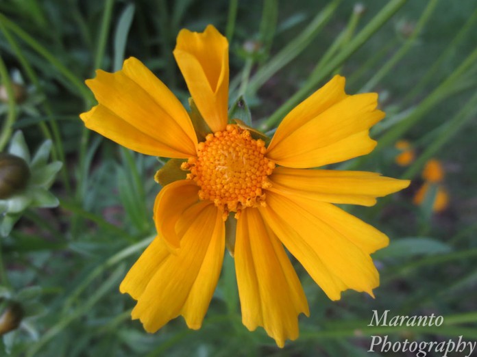
ISO 400 4.3mm f/2.7 1/200
The wildflower, able to restore the planet and look beautiful at the same time. Perhaps it would be no surprise to learn that I am taking a graphic design class on line and was thinking about text and typography this week. When it came to creating this image I used Photoshop. For fun, I clicked the 3D button once I had “Superher” as a layer. There is a lot that you can do within that 3D setting, so basically I just worked with the settings until I came up with something I liked. As far as the color of the text, I used the eyedropper to click around on the wildflower until I came upon this color option that I felt suited the flower. I wanted the text to both stand out but yet resemble a petal.
Then came the cropping, the version of the image I was working with first looked like this:
ISO 400 4.3mm f/2.7 1/200
More about how I first edited this photo is here. As you can see I have chosen in the superhero version to crop out a lot of the green. I also made the choice to crop out the tips of some of the petals. What do you think of this crop? It’s rare that I crop out part of the subject, so it feels a little odd to me. How about the text, do you like it? do you think it works with this photo? Your comments are welcome below.
Cheers!

This is very creative ! Nice interpretation of the challenge !
LikeLike
Thank you, I’m glad you like my take on the challenge.
LikeLike
Your photography is always so enjoyable to look at, Amy. A lovely ‘Super Hero’ flower. 🙂
LikeLike
Thank you!
LikeLike
I like it. It is something different from you, especially with the text. Tranforming photos is sometimes no easy feat – you can spend hours on playing around with one and still not be satisfied 😀
LikeLike
Thanks Mabel, I tend to keep my photography free of this type of editing, but I guess it just came together for this sort of challenge. The idea of “superhero” to me does conjure up the idea of suspending reality.
LikeLiked by 1 person
Well after a few looks and after reading – I say you are “super her” – get it?
Well love how you used the center of the flower as the “o”
And I do like the way the word takes the shspe of a wavy petal – even though I I did miss it at first – but I noticed the “o” right away –
I also love the cropping – it worked .
.
LikeLike
I get it, although I’ll admit I had not thought of that at all!
LikeLike
😊🌺🌺🌺
LikeLike
Very cool, Amy! I haven’t tried the 3D on ps, will give a try later. Thank you!
LikeLike
It was one of this moments where I thought, “I wonder what would happen if I push this button…”
LikeLiked by 1 person
It seems a long and hard process… You did a great job.
LikeLike
Thanks Amy!
LikeLike
Hi, Amy. I think the crop works great and the shot is great. I guess I’m a bit uncertain about the text. At first I thought the “o” was missing (duh), but then realized it was intentional. The text seems intrusive in the shot. I’m almost wishing you could put the text in a border/frame. The color of the text is perfect.
LikeLike
I hadn’t considered adding an actual frame, that’s an interesting thought. Incorporating text into the actual flower is a bit of a reach here. Now that I have had a few days to think about it, I’m wondering if making the flower less “real” with a filter of some kind might have been more effective. Always nice to have a list of things to think about for next time! Thanks for your thoughts.
LikeLiked by 1 person
Hello Amy ! Nice interpretation of the challenge ! In general I’m not a big fan of text on pictures (but it’s totally subjective). Here I think it’s original, it fits for a challenge 🙂
LikeLike
Thanks, I will say, it’s not something I do a lot of.
LikeLiked by 1 person
Hi Amy, The crop gives the image an effective punch. Beautiful capture and creative process.
LikeLike
Thanks, the idea of cropping out part of the subject is something that I don’t do that often.
LikeLiked by 1 person