When it comes to this blog, I pretty much stick with my photography work. I also work with graphic design, mostly designing logos. I use Photoshop or Lightroom for my photography and Illustrator for my graphic design work. Generally speaking I don’t mix the two. Illustrator does have an interesting feature though called image trace. Basically you place your image into the program and it makes a likeness for you. I’ve included the link if you would like a bit more detail, but in simple terms, there are several presets, you pick one, and it gets to work for you. Settings include sketch options and photo options. I’ve had some luck with it the past, but I suspect that part of the reason I don’t do much with my photography in Illustrator is that I like my photograph to look like a photograph. I can be a bit narrow minded that way.
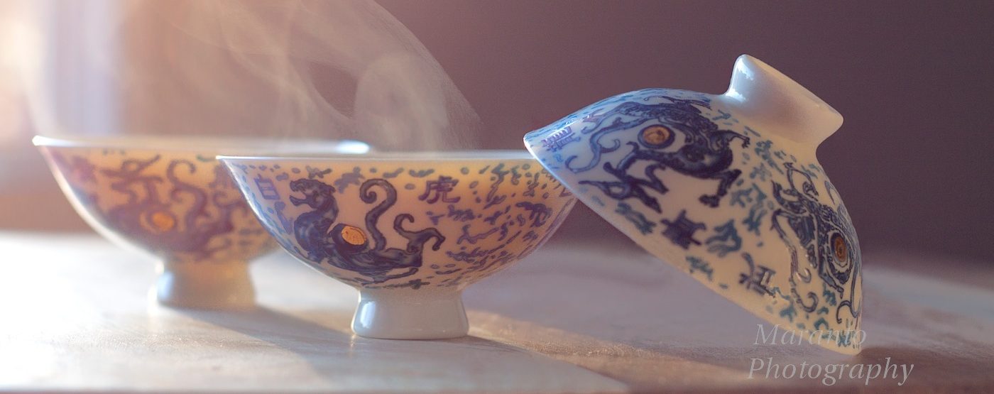
Last week though, I was working with this photograph:
This is a photo that in my opinion has some nice elements and some not so nice elements. Because of that this is the kind of photo that I am more likely to try something a bit different with. So I fired up Illustrator.
It was a disaster.
So bad, that I’m not going to show it to you. Mostly because I didn’t even save it.
Then I shut down Illustrator and re-opened Photoshop. And I created this:
I’ll be honest, I’m not a fan. I like the idea though, so I will probably try it again with another photo or maybe just working the filters a bit differently.
This experiment in mixing it up took at least an hour, maybe more. On one hand it’s a bit frustrating to not have an outcome that I like, but on the other, I’ll never get any better if I don’t experiment with new ideas. When it comes to being creative, do you like to mix it up, do you have more than one medium? do you ever mix the two? How do you feel about your creative projects that aren’t so great? Feel free to leave a comment below.
Cheers!


Oops, I have missed your recent posts…
LikeLike
Well, I’m glad to have you back 🙂
LikeLike
In the past I’ve used illustrator on top of photos when I want to draw on the photo. Maybe adding a doodle, or outlining the subject. I usually use a contrasting color and set my opacity to 80%. Think of the old ah-ha video. It can be a neat effect.
LikeLike
I remember that video, how crazy different it was at the time. Anytime I’ve done the text on photo with Illustrator it has come out a bit awkward. Two reasons I think, 1. Lack of practice 2. My photos aren’t really suited for it.
LikeLiked by 1 person