
A while back I blogged about this photo:
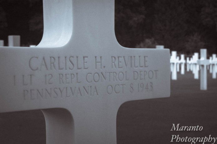
ISO 800 50mm f/13 1/160
Based on what I could find online, a few things like his name and date of birth didn’t seem to add up when you looked at this grave marker. So I went back to the Cambridge American Cemetery and Memorial. The staff member who helped me was a bit surprised that I wasn’t researching a relative,but was more than happy to give me a hand in my research. It ended up being pretty simple. The Carlisle H. Reville whose grave I photographed, was Carlisle H. Reville Jr. My search had been further complicated by the fact that the 1930 Census record was handwritten, and the later data entry spelled his first name wrong.

It’s easy to see why a mistake was made.
So, on the data entry portion of this page, he is listed as “Caulislo”, easy to see why.
In the course of my research I found out that Reville Sr. had served in WWI. I also found out that Reville Jr. had first been buried at another cemetery but was moved here when this cemetery was established. What I can’t find is a decent lead on the family, other than they were living in Pennsylvania in the 1930’s and 1940’s. If you happen to know this family, I am more than happy to have them contact me if they would like a digital copy of the photo I have taken of their relative’s grave.
Since I was back at the cemetery, you know that I took some more pictures. Here is one from that day:
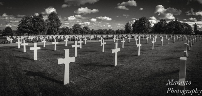
The edited black and white version
I’ve edited this in Lightroom and using a black and white plug-in. I’ll post the original below, but one of the first things I did while it was still a color version was to bring out detail in the shadows and increase the saturation in the blues and the greens. It looks horrible in that state, but once it is converted to black and white it looks good again. Here is the original file:

The original
The subject is well suited to black and white I think. I’ve included it in my portfolio at Picfair. Somehow the color version just seems to vivid for the subject matter. What do you think? Feel free to comment on my new photo or on the follow up from my older post.
Cheers!

The B&W is for me, more powerful… It increases the drama of the site!
LikeLike
I suspect that is part of the reason why I chose black and white for this edit.
LikeLiked by 1 person
Ah, so mystery solved. That was an informative second visit, but it would be great – as you said – if you could pinpoint where the family are today.
I really like the BW version. The saturation certain did make it “pop” in BW, and the clouds stood out very nicely in the final image. It is amazing how initial editing can change the final BW composite (I’m probably sounding naive in saying this, but BW photography is not something I have experimented in too much) 🙂
LikeLike
I went to a presentation on black and white photography a few years ago and the technique of saturation of the color version before the transition to black and white was suggested as a possible technique. It was something I’d not really thought of until then. In this case I think it helped though.
LikeLiked by 1 person
I like both versions, really. The depth of field especially is more obvious in the color.
On another note, isn’t it interesting where our photography takes us? The man may not have understood your motive for your research but I sure do!
LikeLike
It was interesting, I was afraid the guy helping me was not going to help me once he found out that it wasn’t for a family member, but was relieved when that wasn’t the case. You are right, I never really expected this original photo to lead here, but it has been an interesting journey.
LikeLiked by 1 person
The B&W is a great option for this one!
LikeLike
Thanks!
LikeLiked by 1 person
The color version does look too vivid. I have done a small amount of researching my family history and I found a couple times when the names were spelled wrong.
LikeLike
It was interesting to have that pointed out to me, and realize how easy it is to make a simple mistake like this.
LikeLike
Hi Amy/ seeing the handwriting makes me appreciate digital – even tho errors are still made.
I agree the b-w is better – and I saw this on twitter a few days ago and liked it so much….
However the one thing I really like about the color version is that the row to the extreme right never stood out to me any of the times I viewed the b-w.
And so I find that the color version has maybe more breadth to the frontline whereas the b-w has other perks –
LikeLike
Interesting that you pick up on that detail, the black and white has a vignette on it as well, so the edges of the photo are darkened, an attempt to keep your eye in the photo.
LikeLiked by 1 person
Well it worked !
Science !
LikeLike
Indeed 🙂
LikeLiked by 1 person
I definitely like the black and white. The clouds stand out more and it seems to have more depth. Nice work.
LikeLike
Thank you very much.
LikeLike
We traveled to Luxembourg last year to visit my uncle’s grave in the American Cemetery there. It is powerful to see all those white crosses and know that families all over the Country were impacted by the loss of a loved one while s/he fought to keep our Country free. Black and white or color, they both hit deep in my soul.
LikeLike
It’s the stark minimalism of places like this that get to me. Thanks for your thoughtful comment.
LikeLiked by 1 person
Excellent research Amy. I agree the black and white is more suited to the subject and works very well. As to the other looking horrible well I wouldn’t say that but then I do like color.
LikeLike
Thanks Sue!
LikeLiked by 1 person
Black and white is the winning shot. I agree with you! Lovely shadowing. Very powerful.
LikeLike
Thank you.
LikeLike
The transition from color to black and white gave it so much emotion. You have the photographer’s “touch”.
LikeLike
Thank you for your kind comment.
LikeLike