

The Colosseum in Rome is beautiful. We walked through it, admiring it, amazed at how well it has weathered the years considering how long it has been a part of the landscape. But it was a bit tough to photograph. Of the photos I have edited so far, my favorite view is one that I got from the nearby Palatine Hill:
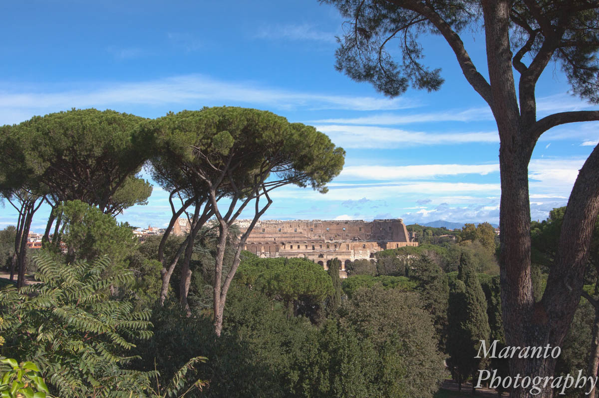
ISO 640 22mm f/10 1/800
This version, actually an HDR version, three exposures of the same photograph blended into one in Photoshop. I wasn’t crazy about the way it turned out. Particularly the sky. So, I created a black and white version:

ISO 640 22mm f/10 1/800
It’s ok, but still not crazy about the sky. One of the reasons I thought to edit it into black and white is that a lot of times a very vivid color photo makes for a nice black and white version. In this case, it falls a bit flat I think. So I created another version:

ISO 640 22mm f/10 1/800
To create this version I opened both the color and black and white version in Photoshop as individual layers. I put the black and white on top, then I lowered the opacity of that layer so that some of the colors would show through. It’s this version that I ended up liking best and it went into my Picfair portfolio.
Do you like the combination image that I created, or do you prefer just the color or black and white version? Feel free to leave a comment below.
Cheers!

I do like the ‘original’ color version, but I think my pick is the combined one! ☺
Black and whites of pictures with a whole lot of trees in them usually turn out flat for me too – it’s a shame the vivid greens don’t translate well.
LikeLike
Yes, I find that greens are either a hit or miss and in this case, it was a miss. What the original version does convey is how vivid and bright it was the day we were visiting.
LikeLiked by 1 person
I really like your combination photo!
LikeLike
Thank you 🙂
LikeLike
Pingback: WPC: Weathered | Lillie-Put
I like the color version, but no surprise – I’m not known for being subtle!
LikeLike
I do feel like that version is a good representation of how vivid that day was, the sun was out in force at that particular moment and the photo captures that well.
LikeLike
I love the combination.
LikeLike
Thank you.
LikeLiked by 1 person
I am drawn to bright colors, so that one is my favorite – but I really like your edits as well. Can’t go wrong when you start with a nicely captured image!
LikeLike
It is vivid; thank you for your feedback 🙂
LikeLike
We were in Rome in November – endless great photo subjects, especially the umbrella pines of which I may just have taken too many photos 😺. The biggest challenge I found was fighting the insane dynamic range between the sky and pretty much everything else. In the end I just began either photographing umbrella pines with sky, or other things and didn’t include any sky 😂
LikeLike
Ok, so I was there just a few weeks before you, and I am glad to hear that someone else had the same “problem” 🙂 I also agree that there was so much to photograph! I am still working on going through what I have and sorting, including deleting the duds.
LikeLike
The last version I like best! 🙂
LikeLike
Thank you very much.
LikeLike
My preference is for the first color one. What I most like, though, is the original perspective. Not the usual ‘postcard’ view. Very nice!
LikeLike
Thank you very much. I was a bit surprised at the number of people not taking that exact view. It really appealed to me.
LikeLiked by 1 person
I agree with you in that the last version is the strongest. I like the faded colours the combination of the two previous versions have resulted in. And yes, Colosseum is difficult to shoot, if nothing else because it’s hard to find a new way of seeing it. But I think you did great.
LikeLike
Thank you very much. This particular view I liked a lot. As we were walking through the area I kept looking back to see if I could see the Colosseum, and then there was this break in the trees that provided this view.
LikeLiked by 1 person
I like the combination a lot. I think it adds richness and depth of detail to the black and white. The sky looks delicious! Thank you for sharing how you did this, I find it inspiring and helpful.
LikeLike
I like keeping track of various editing things I have tried, so it is helpful to write posts like this, I am glad to hear that you found it interesting to read.
LikeLike
Actually they are all magnificent and evoke different feelings. The first is bursting with energy, the second gardens back to a time long gone, the third is stunningly subtle. Do I have to choose or can I pick all three 😊
LikeLiked by 2 people
Good news, there is no right answer 🙂 so you can pick as many as you like or none at all 🙂
LikeLiked by 2 people
You enjoy challenging yourself, Amy, and us too! Somehow the final version seems artistic, while the original is obviously more true to Rome’s colours.
LikeLiked by 1 person
And what a bright day it was, as the original color version conveys 🙂
LikeLiked by 2 people
Now that’s a great perspective on the Coliseum. Almost all other shots I’ve seen are from the ground up. I’ve never seen a composition like this before.
LikeLiked by 1 person
Thanks, Rome was an interesting city to shoot. I think you would have enjoyed the many street photography moments that were there. I was happy to have “found” this particular view. It was one of those, “ah ha, there’s the photo I want” sort of moments. I have plenty of standard shot to go through as well though 🙂
LikeLiked by 2 people
I would love to do street photography there.
Guess what? Just last night, my wife and I went to the movies to see ‘All the Money in the World’. There is a scene in which you pass by the Coliseum and pan up toward some nearby hills. It was only a flash but I swear that I could make out the tree line that appears in your picture. Indicating approximately where you stood to make this shot.
That was something to me because I’m often interested in the vantage points that inspire artists. For example, despite the amount of time that has passed, it is still possible to find some of the locations across Canada where Group of Seven artists sat to paint their landscapes.
LikeLiked by 1 person
Oh, you might be interested in a trip I am planning for this year. It will be to Normandy, France. One of the days we will be doing a driving tour along a route that will take us past some spots where impressionist painters worked. I’m looking forward to that, to seeing places I have seen interpreted in paintings and then seeing them in real life.
LikeLiked by 2 people
Pingback: Weathered – Sign – What's (in) the picture?
I like the colour version – the contrast of the ancient civilisation with the contemporary, with the sky and greenery representing now.
LikeLike
Thanks for your comment, I think that is true, the color version does bring out that contrast between the old and new.
LikeLiked by 1 person
Yes I do like the color and b/w version! It leaves the feeling of being hand colored.
LikeLike
It somewhat reminded me of a postcard.
LikeLike
Love the combination one with the two layers; it gives it a vintage feel which is perfect for the weathered theme. Beautiful! You are very talented and I’ve enjoyed your photographs so far and am learning from your process too, thanks so much for sharing.
LikeLiked by 1 person
Thank you very much for your thoughtful comment. I’m glad you enjoyed reading.
LikeLiked by 1 person
An interesting choice Amy. First, I really liked the perspective and composition of the shot so it’s hard to go wrong! Of the various versions, I prefer the last, but I would have liked the B&W best if you’d increased the contrast a bit. Did you try Nik’s Silver Efex Pro on it? Maybe a sepia for an old-time feeling? Worth playing further because it’s such a good shot to begin with IMHO!
LikeLiked by 1 person
Yes, that is a Silver Efex Pro version in the black and white. I wasn’t fully satisfied with it, but maybe I should try to increase the contrast on that version and see what happens. Thanks for suggesting it, the original color version has so much contrast, it honestly didn’t occur to me to try and increase the contrast in the black and white.
LikeLiked by 1 person
I really appreciate to see the combination images and to read how you did and thought. For me spontaneously, the colored one is best but when I look at the last one again and compare i change my mind. Then finally, I can´t decide. 😀
LikeLiked by 1 person
Luckily there is no correct answer 🙂 Thank you for stopping by and commenting, I do appreciate it.
LikeLiked by 2 people
The trees look weathered too!
LikeLiked by 1 person
Those trees are quite beautiful and look weathered regardless of their age 🙂
LikeLiked by 2 people
YES!
LikeLiked by 1 person
First photo, I love it. Colors are great and when living among snow, they warm my mind. 🙂
LikeLiked by 1 person
You bring up a very interesting point about color and its absence 🙂 Stay warm 🙂
LikeLiked by 2 people
Love the combined Photo. I am getting more involved in photography and love learning new things!
Chill Mom Julia
LikeLiked by 1 person
Thank you, and photography will certainly provide you with new things to learn!
LikeLiked by 2 people
Oh! Amy, I was thinking along the same lines as you, that the black-and-white was somehow flatter than expected. And then I hit your third image, the blend of color and b&w, and it was perfect. Such a nice result.
I did not know that putting a photo into black-and-white that has a dramatic sky can have good results. Learning from you all the time! 🙂 Remind me, when were you in Rome?
LikeLiked by 1 person
Thank you for your thoughtful response to what I was attempting to do here. We were in Rome in October. We ended up having really nice weather for this trip.
LikeLiked by 2 people
Of course! It was uncanny how my thoughts were going along the lines that your post went … hmmm, the black-and-white lost a lot of the drama, maybe … yes! She’s bringing back color in the sky! Woo hoo! 🙂 fun read.
LikeLike
It was a fun photo to create, I’m glad you enjoyed it too 🙂
LikeLiked by 2 people
🙂
LikeLiked by 1 person
I’d go for the saturated colors version 🙂
LikeLiked by 1 person
Thanks 🙂
LikeLiked by 1 person
Very beautifully captured 👌👌
LikeLike
Thank you.
LikeLike