
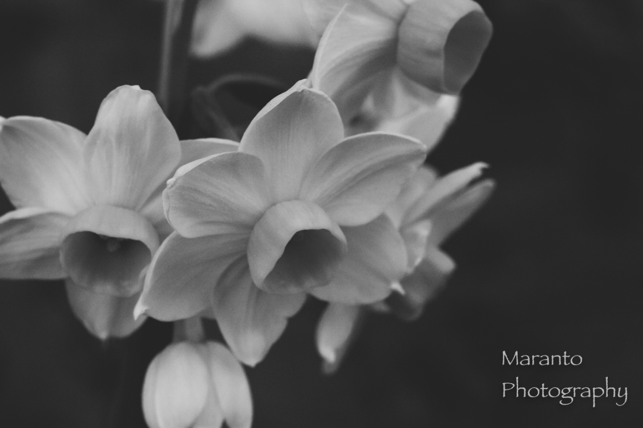
The daffodil is my favorite flower:

ISO 2500 50mm f/11 1/100sec
Here devoid of color not texture:

ISO 2500 50mm f/11 1/100sec
Tell me your favorite, comment below.
Cheers!
Picfair version is here in black and white and here in color.
Added to One Word Sunday, Monochrome, Cee’s Flower of the Day, and Six-Word Saturday.

Great photo – I prefer the colour version. I mostly do with photos of flowers because it just feels wrong to me to rob them of their hues, bright or soft. Colour to me seems to be the nature of flowers. (But I sometimes do, too.)
LikeLike
I tend to go with color too for flowers 🙂
LikeLiked by 1 person
Hi,I like both… maybe a preference for the color…. colored flowers: a happy feeling…. have a nice weekend:)!
LikeLike
Thanks, yes, these particular daffodils were very cheerful and a welcome reminder of the Spring.
LikeLiked by 1 person
Converting a favourite into B&W is a great idea.
LikeLike
Thanks, I remember to try it sometimes 🙂
LikeLike
When I look at both photos, after seeing the BW, I can then notice the texture when I go back to the color version. Nice. Cheers!
LikeLike
Thanks for leaving this comment. I agree, the black and white really makes me think about the texture, something I don’t always think about with flowers.
LikeLiked by 1 person
I really like the b&w version. I think the shapes of the flowers really come out in these photos.
LikeLike
Thank you, it is something about monochrome sometimes, how it changes what you notice about a subject.
LikeLike
I love doing floral photos and I never think that going B/W will look like anything, but they always seem to take on their own character in B/W in ways you never expect. It’s a toss up here, I really like the warm yellows in the color but black and white is hard to beat.
LikeLiked by 1 person
Thank you for your kind and thoughtful comment. I honestly don’t always even think to try to convert flowers into black and white.
LikeLike
These are gorgeous photos in both color and black and white 😀
LikeLike
Thanks, Cee.
LikeLike
Both are gorgeous shots. I really love that yellow though. Beautiful.
LikeLike
Thank you very much!
LikeLike
The color one’s like candy. Beautiful photo. The black and white shows off the composition and texture for sure, but most of the time I’m a color gal. 🙂
LikeLike
I tend more towards color also, not just for nature images but for photography in general. This is at least part of the reason that I really like challenges like these, they really are a challenge for me 🙂
LikeLiked by 1 person
Pingback: Fire – Travel with Intent
You know me to love BW. As much as I like the vibrant colour version, I appreciate your BW treatment more. Knowing me, I’d shoot it with a lot of contrast but I can see that would have been the wrong route for this piece. The lest harsh contrast revealing more greys than black and stark white is the best way to go for this shot.
I like how you left the right third virtually empty.
LikeLike
Thank you for your thoughtful critique. I also think that empty space really helps this image, I tend to be more a “fill the frame” type, but space works here.
LikeLike
Aw, and what a sunny flower to have as your favorite! I love the color version which really brings out the daffodils warmth.
LikeLike
They come in so many color varieties too 🙂
LikeLiked by 1 person
Well I love color but I see what you mean about the texture in black and white.
LikeLike
Yes, when it comes to flowers I tend to prefer color, part of what made this a challenge 🙂
LikeLiked by 1 person
Lovely shot. I think you’re right–the black and white really highlights the texture of the flower. I love it!
LikeLike
Thank you very much!
LikeLike