
I think I am going to file this too: never do this again.
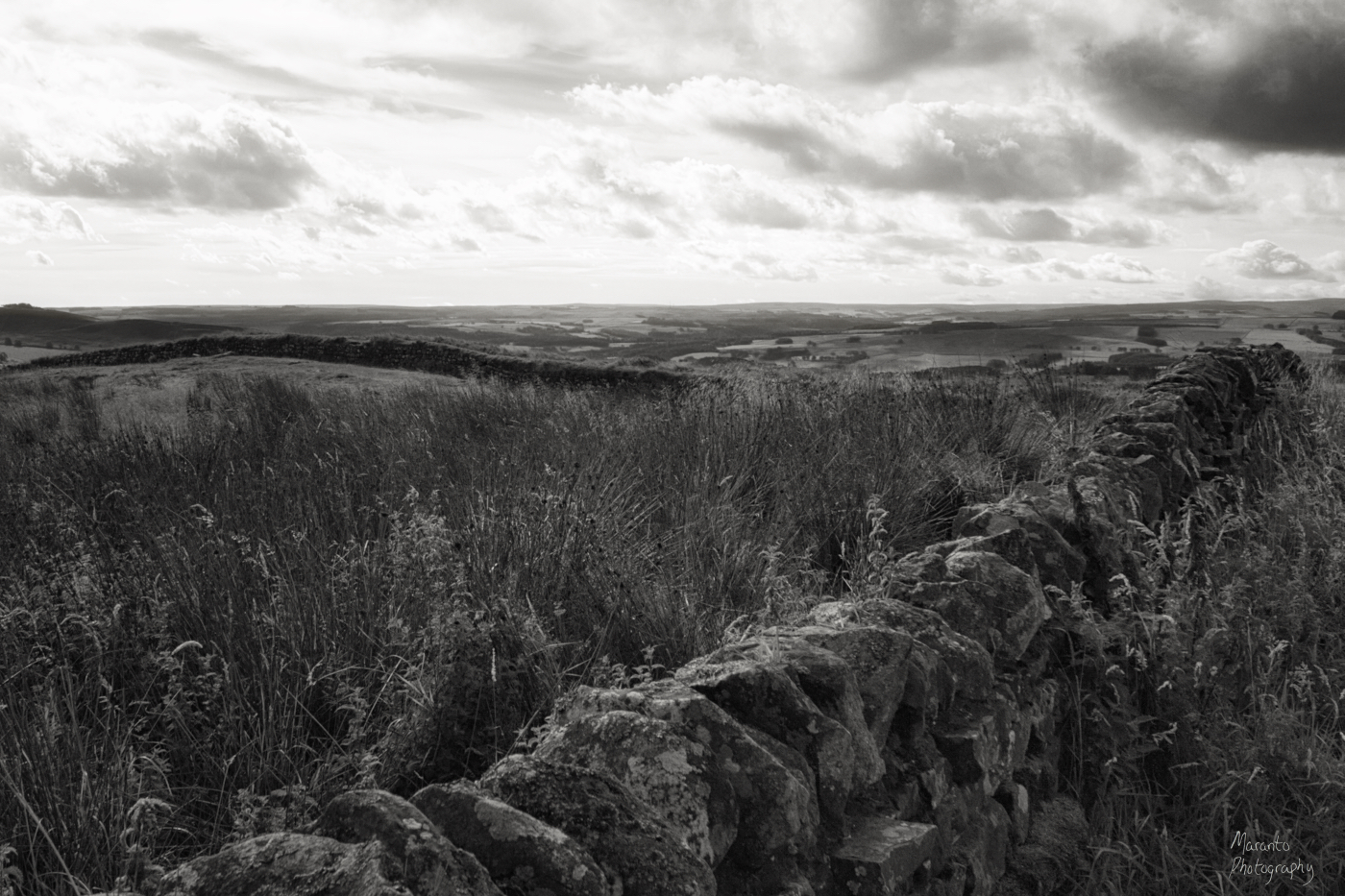
It all started out well enough, I was looking at this file, taken at Hadrian’s Wall:
ISO 800 22mm f/14 1/800sec
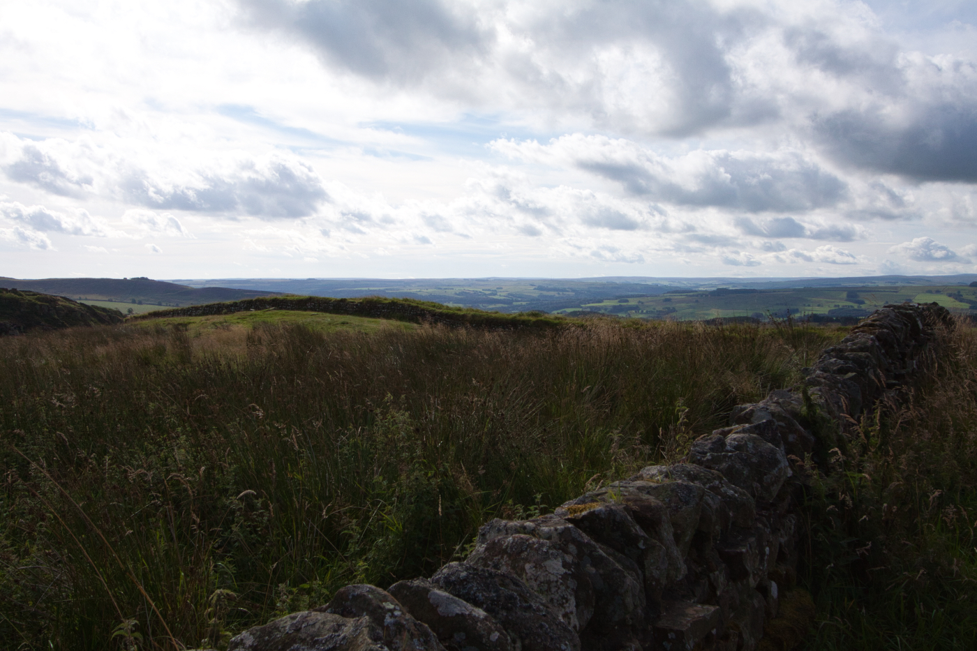
It’s nice but needs a bit of work. So, from that I created this version:

ISO 800 22mm f/14 1/800sec
Before dealing with the exposure, I applied a crop. I’ve used the rule of thirds overlay for this because, as I suspected, there was a stronger composition lurking within the original file. Then I considered the exposure; this image was created using the shadows slider to lighten the shadows, then I moved the black and white sliders around until the image looked good to me. I sharpened the photo by increasing the details sliders just a bit.
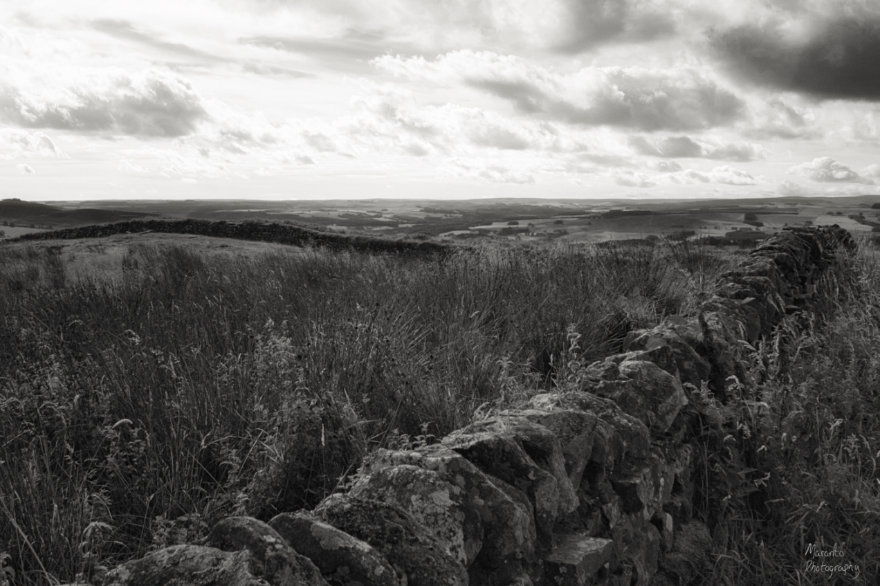
Then I created this black and white version:
ISO 800 22mm f/14 1/800sec
That is now lost for all time. I state in a very dramatic fashion. Here’s what I did wrong. After making this version and saving off a blog-sized copy, I went back in the history to the color version and did the steps to add a watermark. I saved off my blog-sized copy of that. Then when I dropped the history tab again to go back to the black and white version, all that history was gone.
Two things, somehow that seems like that shouldn’t have happened and at the same time, I feel like I should have known that would happen. So yes, I should have saved a full-size version of that black and white prior to mucking about in the history. In Luminar, the way I am doing that (when I am doing things properly) is to export it to my hard drive labeled as a version. In my formatting on my drive, this version would have been: file number + Lum + BW.
Instead, I have just a smaller, blog version. So, I am writing this cautionary blog post to remind myself to do it differently next time.
What do you think of my color version versus the black and white? I have to say that I personally prefer the color, in my opinion, there is a bit of something that just didn’t translate into the black and white. Feel free to leave a comment below.
My Instagram version is here:
Cheers!
Color version is on Picfair.
Added to Cee’s Black and White Challenge, Fences and Gates.

Beautiful image! I do prefer the color too 😊💕
LikeLike
Thanks very much.
LikeLiked by 1 person
Hm – I like the edited color version and the b/w equally-
And nice photo to work with – sorry you lost your original
LikeLike
Live and learn right? 🙂
LikeLiked by 1 person
color
LikeLike
🙂
LikeLiked by 1 person
I think both the colour and black and white have their own characteristics. The black and white version somehow, for me, articulates more clearly the ancient and age aspect of the wall. Lovely image. I’ve visited the wall and found it to be both mysterious and fascinating.
LikeLiked by 1 person
I agree that the black and white works for the wall itself, I guess I was dissatisfied in this case with the way it turned out in the landscape. Thanks for your thoughts on this.
LikeLiked by 1 person
I love the colour version Amy, maybe this was just meant to be 😉💖
LikeLike
Thanks, that could very well be! Also a good learning moment for me 🙂
LikeLiked by 1 person
you did a good job darkening the sky and lightening the foreground. I sometimes take 3 images at multiple exposures and use the darker one for the sky. My Nikon 750 camera brackets.
LikeLiked by 1 person
Yes, I often shoot bracketed for shots like this, and in fact, I did for this but I wasn’t crazy with the way they turned out and didn’t really want to do an HDR or similar processing with the files I had to work with.
LikeLike
That fence has been there a long time. Great photos.
LikeLike
Thanks Cee.
LikeLike
I know BW can be great but in this case I prefer the colour one.
LikeLike
Thank you.
LikeLike
Oh dear, that sounds familiar! I have lost a lot of files during the years, totally unbeknown to me at the times when I saved images for our blog. It wasn’t until a couple of years ago that I learned the way to go with a file for the raws, one for the processed, one for the cropped – and still it’s easy to make a mistake, even just by moving a file in LR. I’m still not there yet with the individual tags to the images, it takes ages to complete …
As for the photos, I prefer the one in colour. It’s a great place to be, we have fond memories of hiking along Hadrian’s wall.
LikeLike
Sounds like you have developed a solid system though and that is really important. I’m at a bit of a vulnerable spot at the moment because I am switching editing software, there is always a learning curve with that, including on how to best save your work.
We also enjoyed our time at Hadrian’s Wall and had really nice weather while we were there.
LikeLiked by 1 person
Have you tried Affinity? I’m not using it, but I know many who went for it as an alternative to Adobe.
LikeLike
I have not tried Affinity. At the moment I am putting Luminar 3 through a trial run, I’m pretty happy with it overall and they are supposed to be releasing a few more features, which if they can do that I will then be able to drop Adobe.
LikeLiked by 1 person
I’ve done it too. I saved only the small resized image that went into a post, then realized later that I wanted the large image for something else. Computer programmers often made a similar mistake in ancient times: they discarded the source code after the “last” translation (from a relatively readable programming language to machine code) of the “final” version of a program. There was even a flurry of research into translating backwards, from machine level to source level. People soon realized that “Save the source code!” should just be carved in stone.
Glad U lightened the dark foreground. Sometimes it takes a lot of editing to make a photo look the way a contrasty scene looked to the human eye.
As usual, I prefer color to grayscale.
LikeLike
Thanks very much, the color version is my preference here too. Probably “save a version” should be carved into stone for photographers, and I feel like I should have known better in this case! Oh well, live and (hopefully) learn.
LikeLiked by 1 person
Some hard learnign there but then that is where the best lessons come from as painful as they are. It’s the colour one for me Amy.
LikeLike
Thanks very much Sue. This is a bit of a tough lesson because really I should have already known! but I guess not, so here I am 🙂
LikeLike
Color.
LikeLike
Thanks 🙂
LikeLike