
This week for the travel theme illuminated, you will have to humor me because the traveling I am talking about is in my mind. I started a new semester this week, so here is my desk as I am trying to illuminate my mind with Photoshop:
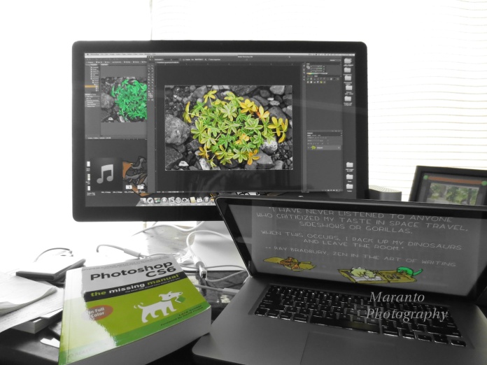
ISO 800 4mm 0ev f/2.7 1/50
To take this image I used my Canon PowerShot. I chose my point and shoot because I wanted to try a few of the creative settings it has to see if I could tell a story using one of the settings. The settings I tried before this one were fisheye and toy camera. Neither struck my imagination. Then I decided to use the setting which lets you choose one accent color and the rest of the image is rendered in black and white. I knew the accent color I wanted was green. I wanted to pick up the file that I was working on, the dinosaurs in my screen saver, the textbook, and a hint of the photo that is sitting on the desk. Because that is a lot to look at, I think it is important that the rest of the image is black and white.
I did choose to blow out the background by having a lot of light behind the desk. Do you like that effect? What so you think of the use of the single color green?
I’d also like to know that my awesome screen background was created by The Queen Creative and a link to a blog about that background can be found here.
For those of you who stop by on a regular basis, I would like to let you know that I got an A in the first semester of this class and I’d like to say thanks to all of you who wished me luck and encouraged me through the semester.
Cheers!

Well done for getting your A!
LikeLike
Thanks 🙂
LikeLike
I like what you’ve done here the green highlight works very well .
You are illuminating yourself in many ways Amy !
That’s super news on your *A result and very well deserved.
Such attention to detail in your blog posts about your photography is a measure of what work you would put into your course.
LikeLike
Thanks so much for your kind comment. I’m glad you like what I have done with this photo as well. Sometimes it is just fun to get out the camera and try a different setting 🙂
LikeLike
Congratulations and well done! : )))
LikeLike
Thank you!
LikeLike
Congrats Amy! I can see you had lots of fun with this shot and it looks really beautiful! I love the accent colour. 😀 *hugs*
LikeLike
I know you like to experiment, so I figured you might like this one 🙂 I also tried blue as an accent color, but honestly that just blended in with the rest of the image and was too subtle for what I was trying to get across.
LikeLike
Oh, I always like to see your edits and you always explain it so thoroughly and clever. It’s fun to experiment. 😀
LikeLike
Thanks and you are right, it is fun to play 🙂
LikeLike
I like the single accent color of green and the photo in general. Great! I don’t have Photoshop so I can’t do these amazing things! Congratulations on your A! What are you taking? I’m afraid I missed earlier posts about your course. 🙂
LikeLike
I am taking a Photoshop class at my local community college 🙂 Just think, if we lived in the same area we might have crossed paths last semester 🙂
Anyway, I took Photoshop I last semester and now am taking Photoshop II.
LikeLike
That sounds really great. Good luck with it! 🙂
LikeLike
Thanks 🙂
LikeLike
You did a great job with this assignment. YES, I loved the blown out effect…it drives the eye right back to where it belongs.
LikeLike
Thanks, I’m glad you like it 🙂
LikeLike
I think it was a good decision to leave the greens and turn the rest into B&W. The Rad Bradbury quote is funny too.
Congrats on your A!
LikeLike
Thanks, I couldn’t resist that background by The Queen Creative when it was offered up. I was happy about the A, I am really learning a lot too which makes me happy because I don’t like to feel like I am wasting my time.
LikeLike
Amy – congrats on your A! I certainly know how much hard work went into that! I hope all goes well this semester.
Michele
LikeLike
Thanks Michele, I have high hopes for this semester too 🙂
LikeLike
Nice job on the first semester! I think blowing out the background and choosing the one accent color worked great. I agree- anything more would have made it much too busy. 🙂
LikeLike
Thanks, I’m glad you like the effect. Blowing out the background isn’t something I do (intentionally) too often, but I thought it would work here.
LikeLike
I like the effect, it’s a fun one!
LikeLike
Thanks!
LikeLike
Good for you.
LikeLike
Thank you 🙂
LikeLike
I do not stop by as often as I would like to. I really do like the effects you used in this photo. They work to draw your eye to the fun things on your desk and monitors. The bright light in the background, too. It centers the focus of the photo. Congratulations on your A!
LikeLike
I’m glad you like what I have done here. I learned a lot last semester and was happy with the A as well. I’m always glad to see you here 🙂 but no pressure I know you have a lot going on in your life, so have fun while you are here and I’ll see you next time you have time to visit 🙂
LikeLike
Congratulations on your A in Photoshop I ! And, good luck in Photoshop II. The two photography classes I had wanted to take at the community college did not have enough students sign up, so both classes were cancelled. So, I wound up taking just one class this semester, Computer Art Studio. Hope to see you around. –Ron
LikeLike
Thanks Ron 🙂 I think I am going to prefer the two day a week format to this class instead of one longer one. What did you prefer?
LikeLike
I like the two days per week format better than just one day per week. That seems to work better for me.
LikeLike
I agree with you, I find the longer, once a week format to be draining.
LikeLike
Pingback: 1-16-14 Travel theme Illuminated | The Quotidian Hudson
Congratulations! 😀
LikeLike
Thanks 🙂
LikeLike