
If you look at food advertising, particularly in magazines, I’m guessing you’ve noticed that there are some similarities in what you see. The current fad is for clean, simple images. Usually they are simply lit. Often they convey a sense of casual elegance, an invitation to linger. I think this trend speaks to something that is pretty basic, the need for community, an opportunity to connect. Our lives tend to be full and rushed, these ads speak to the desire to slow down and savor. For my current Photoshop food project I am attempting to capture a bit of that. My images went through a second round of critique and here are two that came out on top:
ISO 320 50mm 0ev f/2.8 1/125

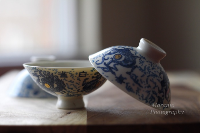
ISO 320 50mm 0ev f/3.5 1/50
If you missed the first round, or just want to look again, you can do so here.
So, they are a bit different from the first round. I simplified the composition, and took a lot of shots because I was working with natural light and wanted to have a lot to choose from. What do you think of these images? Does one appeal to you more than the other? are there certain elements that you like or dislike? Do you like this trend in food advertising? I have to admit that I do. The problem though with fads, is to still make your own work look original, that can be tricky…
I will be shooting again, and have a few ideas of my own, but I would like to hear what you have to say.
Cheers!

I’m liking the moody darker one Amy… Oh .. but then ….
I find it very difficult to set up natural light shots … you’ve done it so well here .
Simplicity really works. I too love the fad 🙂
LikeLike
Thanks, and I can be a bit tricky, the natural light. It is funny how it can be difficult to make something look simple 🙂
LikeLike
The 1st pic appeals to me more 😉 maybe since more of the window is showing / more light.
LikeLike
Thanks, I keep debating about that window, how much to show or not show. It is definitely one of the elements I am still thinking about.
LikeLike
A fad well worth keeping! Loving simplicity and appreciation for the every day myself.
LikeLike
I agree 🙂
LikeLike
These are really nice images. I like the second one, just something about being more at level with items and seeing more of the out of focus one. The straight lines also work for it I think. I agree though, I like also like the trend for simplicity – I see it as a reminder to savour things.
LikeLike
In that one, I’m a bit concerned about those lines maybe being a bit too straight, so thanks for letting me know you like that element.
LikeLike
very nice 🙂
LikeLike
Thanks 🙂
LikeLike
🙂
LikeLike
Amy,
I like the second one best. The slanted union of the brown and white on the table somehow makes the picture look more pleasant.
-Claudia
LikeLike
Thank you, that was an element that I worked with a bit and did end up liking in this particular photo.
LikeLike
I like simplicity, and love your third shot with the angle, the positioning of the objects and the background is cleaner in that one
LikeLike
Thanks, and I think that is one of the things that works in that image.
LikeLike
🙂
LikeLike
Pingback: A FUN FAD! | Words 'n Pics...
I like clean, simple photos, I think yours are wonderful. One of my two bowls would have been blurry.
LikeLike
Thank you, to blur or not is a pretty big issue in this case. I have taken approximately 600 photos for this project so far and what to blur or not is something I have thought a lot about.
LikeLike
What I meant was one of mine would have been blurry by accident. I’m still having trouble getting everything I want in the frame to not be blurry.
LikeLike
At this point, I have taken so many photos, that it has gotten easier to control what is in focus and what isn’t. I really think this is a skill that just requires practice.
LikeLike
Prefer the first one. Just seems more relaxed, and I do like the simple casual tend.
LikeLike
Thank you for saying so, I would agree that that is the more casual of the two photos.
LikeLike
Pingback: Daily Prompt: New Sensation | The Bohemian Rock Star's "Untitled Project"
Pingback: The Camino Plan | Footloose, Fancy-Free…Fashionable?
I like both…but the first one more…don’t know why! 🙂
LikeLike
Fair enough, thanks for saying which you prefer 🙂
LikeLike
I prefer the composition of the top image, but the light on the 2nd image.
LikeLike
Interesting, I am going to be reshooting this and attempting to mix some of these elements up.
LikeLike
Pingback: Daily Prompt: New Sensation | Nola Roots, Texas Heart
Pingback: The Only Thing That Looks Good On Me is You | Views Splash!
Pingback: Daily Prompt: New Sensation | Chronicles of an Anglo Swiss
Pingback: Fashion wins the race | A mom's blog
Stunning shots Amy! 😀
LikeLike
Thanks so much 🙂
LikeLike
Loved the first photo. The subdued effect and the inside of the bowl being visible from over the rim…over all the relaxed effect is achieved more I think.
LikeLike
Thank you letting me know, it is the background in that one that I am thinking of changing a bit.
LikeLike
Pingback: Daily Prompt: New Sensation | The Wandering Poet
Hi Amy, I do like the simplicity of this photo over the first round. I also like the natural surface better than the pink one.
As for this round, I am a fan of the second photo. First, I like the lighting, although the darker one is still nice. Second, I like that the third bowl is part of the shot – it looks more intentional than the first photo. Third, I prefer the background in the second photo. The shadow in the corner creates a nice contrast to the lighting on the bowls (or tea cups?). The positioning of the bowls to the background highlights them in this photo; almost framing them from behind. IMO, the second one is better – hands down. But, what do I know?
LikeLike
You know plenty 🙂 I asked people to share what they thought, because it really does help me think through what I am doing. At this point I am picking out various elements, like the ones that you liked and then reshooting. I’ll have another post probably sometime over the next few days where I have rethought some of these things and then started the process of editing in Photoshop. Thanks for taking the time to write out your opinion, I do appreciate it.
LikeLike
I love these tea images you’ve been creating – they are so crisp and atmospheric. I prefer the lighter one here. : )))
LikeLike
Thanks, and thank for letting me know which you prefer 🙂
LikeLike
To me the second one looked better.
LikeLike
Thank you 🙂
LikeLike
I prefer the top one. It is darker, simpler and the hidden bowl with the light from the window adds a bit of mystery.
LikeLike
Thanks, I’m still making changes and it is pretty neat to see how just little changes can make the photo feel quite different.
LikeLike
Pingback: Weekly Photo Challenge: Take Three | Photography Journal Blog
It’s lovely, it’s hard to make a preference, but I think I go for the second. I love the light and can do without the window! 🙂
Love, Dina
LikeLike
Thanks so much for saying so.
LikeLike
Pingback: Six Hundred Abandoned Photos | Photography Journal Blog
Your style is unique compared to other folks I have read stuff from.
Thank you for posting when you have the opportunity, Guess
I will just bookmark this site.
LikeLike
Thanks very much for your kind comment 🙂
LikeLike